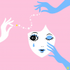
Have you thought about why water drops are always being visually portrayed in the color blue, yet, in reality, water is not blue, it’s clear. This illustration is a visual experiment with semiotics - the study of signs and symbols, their usage, and interpretation. Here, I used blue, black, and pink colors to create this visual interplay and interaction between the concepts of sign, context, designed meaning, and intended response. Your eye might be drawn to the blue teardrop shape on her face, then interpret that as a drop of water, according to your everyday visual experience. But if you read my title, it says, "It's not a teardrop, it’s blue paint." Similar to René Magritte's surreal painting "The Treachery of Images" a.k.a "This is not a pipe", where the image consists of a drawing of a pipe and a line where Magritte wrote, "Ceci n'est pas une pipe" ("This is not a pipe"), this painting is a visual trick, the writing invites us to recognize that what appears to be a pip, is not really a pipe: it is an illusion, nothing more than paint on a flat surface.
Similarly, by making the title "It's a teardrop, it’s blue paint." I want to invite the audience to step out of their conditional interpretation according to the "norms," which are the majority of societal beliefs, and step into something new and whimsical. It is intended to be a playful visual experience for the viewers to experience the tension between words and image, nature and artifice, truth and fiction, reality and surreality.
read more


